
We have been having a very mixed bag of weather here in Mid Devon over the past week. Lots of rain with glimpses of brightness, boy do I need to cling onto the rays of sunshine at the moment. It really does lift my spirits to see the sun

So this weeks blog is , hopefully , some helpful hints to help you with your painting, Art is hard and watercolour is very hard....but having some tricks up your sleeve might get you past some stumbling blocks.
Ok, so first things first, watercolour is tricky. If you are embarking on a journey into watercolour painting then be prepared to be annoyed, frustrated and downright fed up with the whole thing from time to time.
Lots of people start watercolour painting as a hobby because it is relatively cheap to get going, all you need are the paints, some brushes and some paper, and then off you go.
Only to find they have chosen ( in my opinion) one of the most difficult mediums there is. People often make the mistake of looking at an acrylic or an oil painting and trying to replicate it in watercolour.....it won't work . Things are fundamentally different. In watercolour, you work from light to dark, you try to bring out it translucent properties and it is unpredictable, it 's very fluidity means it doesn't stay put!
Ok all is not lost I want to supply you with some weapons in war against watercolour, things that will help you in your quest. Because when it goes right , it is the best feeling in the world, and the it will bring you joy as well as heartbreak, as the best relationships always do.
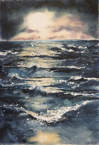
1. Push things into the background by using a purply mixture of cobalt blue and cadmium red . Bluey purple is the last colour our eyes can see at distance so that is why distant hills look this colour and why the sky is blue.

Here you see the distant headlands are a purply blue.

2. You might want to make the viewer rest on a point in the painting , or make a light colour look even lighter or a dark colour even darker. You do this by putting your lightest lights next to your darkest darks.
You see how the white of the paper acts as light so I have put very dark indigo next to it.


3. In a similar way to the lights and darks you can manipulate the viewer by using lost and found edges. Where you want then to look have a nice crisp edge( a found edge) and where you want it to become softer focus have a lost edge ( wet in wet )

This cat is a good example , the fur is out of focus , wet in wet, but the eyes have harder edges and are painted in more detail so they lead the viewers eye. It also provides contrast, always important to make your paintings more interesting.
4. Mark making, this is a phrase used often by artists. To me it means being confident with your brush strokes, try not to do things in patterns, try to be random. Use things at your disposal, finger nails, sticks, knives to make marks in the paint. Use splats and splashes, and describe what you see with the marks you make. If it is prickly and jagged make your marks prickly and jagged. If the water is horizontal then make horizontal marks.
The reflections in the shallows have circles in them, so paint circular lines, I used my finger to pull out wave crests. Be brave, and adventurous.
5. Use movement, pick up your board and move the water and paint around, don't be static, if the light is coming from the right then slant your board leftwards and let the water run, then when it looks ok pop it back on the table to dry. Try to be dynamic and see what happens.

I let the drips run from the bird to the sea.
6. Go with the flow. If you drop some water accidentally or see what they call a happy accident occurs then incorporate it into the painting, or simply just let it be, people like watercolours because they are looser , more fluid. Free yourself and work with the medium, if you want to be fully in control then this may not be the medium for you.

Play around with it , it is more like herding sheep than commanding an army.
7. A simple way to give a painting harmony is to use a limited palette , here I have just used cobalt blue, cadmium red and yellow ochre.

8 Or finally if you want to keep it really simple just use one colour like Paynes Grey, Sepia or Indigo

So there you go, some tools in your tool box to help you with this tricky medium, keep trying because when it goes well it's the best there is !
12 comments
Thank you! Just when I needed to read this! Am a potter normally but with all things shut down turned to watercolor, now in love but very much a beginner again!
Thank you for such a wonderful blog. I sometimes have trouble picking different colours in a picture & love your idea of using one colour – such as sepia to make it easier. ❤️
Thank you for the tips. Really helpful looking forward to putting them into practice!
Thank you again for your blog, I love your work and I am always inspired by it. As a novice all your explanations are so useful.
Thanks Rachael. I love your art! Thanks for all those tips and hints. I shall have fun playing with colour this weekend 😊